Hi, I'm Tom

Product Designer. I prototype
and ship in code
projects that work.

18 yearsof working with clients,
including 10 years with a software house.

ŻywiecAlgidaKnorrAvivaMaspexFuture Processing

Recent work

Collage of slides from a corporate pitch deck system: colorful abstract cover masters, content layouts with copy and photography, and a portrait of a presenter.Pitch Deck SystemPresale ToolkitHand holding an iPhone with the “Dziennik Alergika” allergy diary app open, standing in a sunlit birch meadow with pollen visibly floating in the air.Allergy Diary AppWeb app, mobile-firstA tablet lying on a black quilted leather car seat, showing the Transport Garda website: a Volkswagen Transporter at sunset and a "Call or write for a quote" panel.Transport GardaWeb ProjectIllustration of a smiling man in a suit holding a coffee mug, surrounded by playful teal doodles of code, charts and business icons - key visual for a rebranded consulting website.Website RebrandWeb Project

How I work

I can join your team or take on a whole project.

  1. How we work together

    We talk about the product, the team and the deadline, then pick a model: a B2B contract inside your team or a fixed-price project, with a written plan of scope and stages within a few days.

  2. Getting started

    I get to know the product, the goal and the people on your side. I work in your tools: Figma, GitHub, Jira, Slack or Teams, in sprints or project stages.

  3. Your project

    An app prototype, a brand, a website or support for your team on a contract. I work in short stages and show progress regularly.

    Choose a project

Choose a project:

Product Designer on a B2B contract

I join your product team: flows, UI, prototypes in code and day-to-day work with developers.

from November 2026
Clickable app prototype

A working React and Next.js app to show investors, a tender committee or first users.

about 2 weeks
Brand from scratch

Logotype, visual identity, key visual, social media templates and a mini brand book.

about 3 weeks
Brand and website in one package

Everything in "Brand from scratch" plus a landing page designed, coded and deployed by one person.

about 4 weeks
Website or rebrand

A new site or a refresh of an existing one, from design to deployment.

timeline set after a call
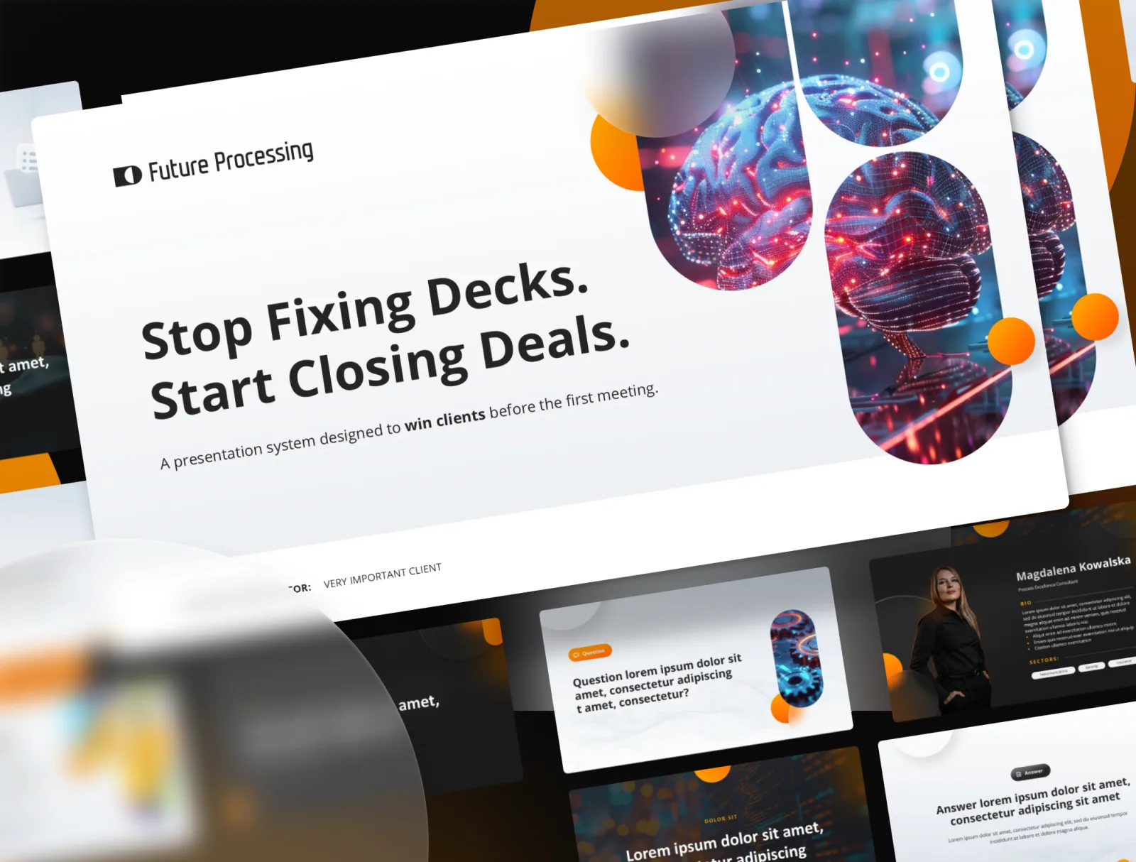
Collage of slides from a corporate pitch deck system.

Pitch Deck System

RoleLead Designer
Skills
  • Design Systems
  • PowerPoint / PPTX
  • Documentation
  • Sales Enablement

Overview

Future Processing - a software house with 800+ people - was shipping every client pitch from a slightly different file. Sales reps kept local copies of the old template, logos and brand identity assets lived in chat threads and shared drives, and a new deck usually meant rebuilding from scratch. No two decks looked the same and nobody knew which one was current.

The real design challenge was not the slides.

It was removing every reason to go back to the old file.

Solution

With the team I designed a deck system: a single PPTX Master file split into nine sections, each solving a specific job in a sales conversation with its own layout rules and component library. By our estimate a new pitch takes about 20 minutes to assemble, without opening a design tool.

The system in numbers:

  1. pre-designed slides covering every sales scenario.
  2. section types with strict layout rules and live components.
  3. employees with access to one Master file.
  4. to assemble a new pitch, no design tool required (estimate).

Inside the system

Reflection

One PPTX file carries the asset library, the icons, the palette and the writing rules, with a short "Read Before Use" section right at the front so a new user sees how to use it before they see the cover.

The outcome: a system in use since 2024, refreshed every six months alongside the company identity (adoption), one source of truth available to 800+ employees (scale), and fewer revision requests with faster client delivery (speed).

Tools & Technologies

  • PowerPoint
  • Figma
  • Illustrator
  • Photoshop
  • PPTX Template
  • Design System
  • Documentation
See the full case on Behance
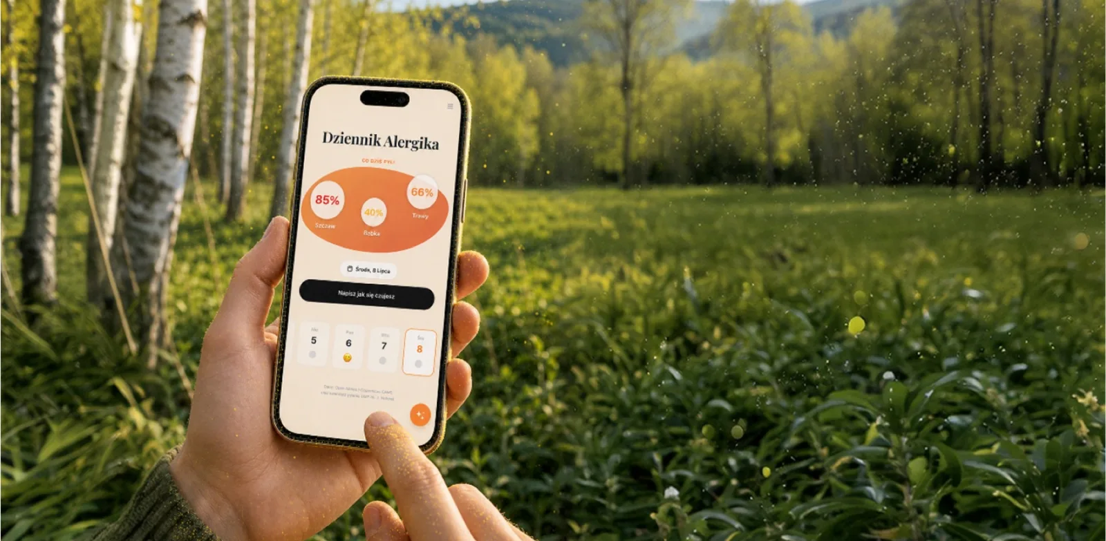
The “Dziennik Alergika” allergy diary app on an iPhone.

Allergy Diary App

See the live site
RoleProduct Designer
Skills
  • PRD
  • Prototyping
  • Product Decisions
  • Reviewing AI-written Code

Overview

After a visit to the allergist with my son, the doctor asked me to keep a log - symptoms, reactions to pollen, meds taken - and bring it back next visit. I did not want another paper notebook, so I decided to properly get to know Claude Code and build the tool I actually needed. No team, no big budget - a few late evenings and a few burned tokens.

The brief was a doctor's request:

keep a log and bring it to the next visit.

I wanted something simple:

  1. Info about what is pollinating in my area today and how strong it is.
  2. A fast calendar entry with overall mood and the meds given.
  3. Monthly reports I can print for the doctor.
  4. Bonus feature: chat with an in-app AI assistant about entries and correlations with meds.

Solution

Built solo end-to-end with Claude Code. The PRD (product requirements document) and the first working build shipped the same day - roughly 3 hours from PRD to a working MVP. Then regular evening sessions across a few weeks: steadily adding features and testing.

Adding an entry: mood, meds, symptoms - all in one screen.

Talking to the AI assistant about the second week of May.

The daily loop is intentionally tiny: one screen, one entry, mood + meds, done in seconds - so I can log while my son is in the room. Pollen levels for my area load automatically from Open-Meteo (no good free Polish API). A monthly report view exports everything the allergist needs, in the order they asked for it.

On top of that sits an in-app AI assistant that answers questions about the entries and can correlate them with the meds taken. The same assistant is also reachable from the outside via API or MCP (the protocol other AI tools use to connect to apps) with your own token, so future integrations do not depend on me touching the code.

Inside the app

Where the AI got it wrong

The AI checked its changes on desktop. Two bugs only showed up on a real phone:

  • The mobile menu did not navigate. The AI built separate headers for phone and desktop, and the close-on-outside-click logic tracked only the desktop one, so every tap closed the menu before the link fired. I pointed at the phone vs desktop difference and the fix took under an hour.
  • The calendar opened on the wrong month. When reopened, it showed the month it was last closed on instead of the right one.

Data and business model

  • The database (Supabase) is hosted in the EU, in Ireland.
  • The AI model (xAI) receives the entry history: mood, meds and pollen, so the assistant can compare, say, the same period a year ago.
  • The demo runs on made-up entries. Only the current pollen data from Open-Meteo is real.
  • Business model: a Stripe subscription, in test mode for now.

Reflection

I work with Claude Code like with a developer I hand tasks to: with a solid PRD it ships, while I own the product decisions and check the result on a real device.

Tools & Technologies

  • Claude Code
  • Notion
  • GitHub
  • Vercel
  • xAI
  • Next.js
  • React
  • Tailwind
  • Supabase
  • Prisma
  • Open-Meteo API

Want to try it?

The demo is open, poke around and send questions.

Open the demo
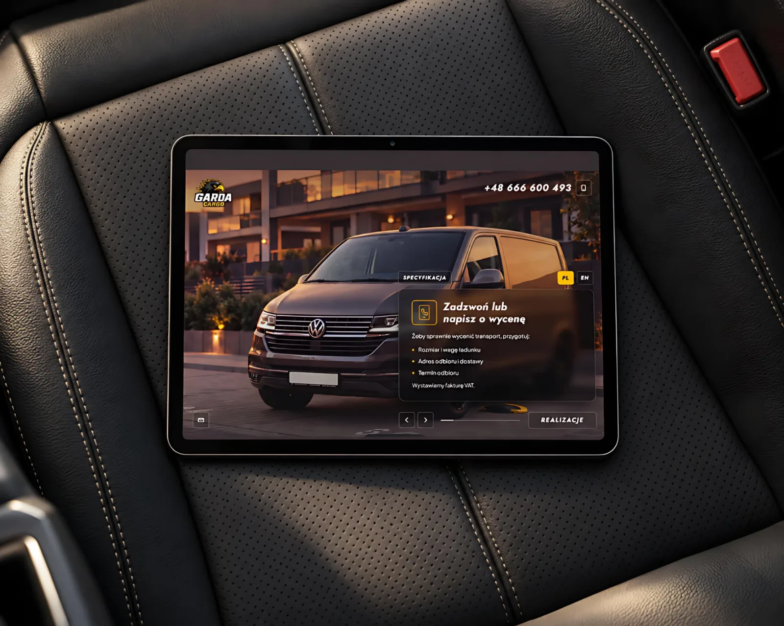
A tablet lying on a black quilted leather car seat, showing the Transport Garda website: a Volkswagen Transporter at sunset and a "Call or write for a quote" panel.

Transport Garda - Transport Company Website

See the live site
RoleWeb designer & developer
Skills
  • Web Design
  • UX
  • Copywriting
  • Front-end (Astro)
  • SEO
  • Deployment

Overview

Problem: Transport Garda moves motorcycles, bikes, equipment and business deliveries across Poland by van. Customers land on the site in a hurry, on a phone, looking for three things: will this company take their load, will it arrive in one piece, and what is the fastest way to get in touch.

Solution: A single screen with no scrolling: three slides on the offer and the tie-down system, a strip of real past jobs, a panel with the van's specs and contact details always at hand. The site runs in Polish and English, and all of its JavaScript is about 3 KB.

Someone moving a motorcycle looks for two things.

A phone number and proof
the bike will arrive in one piece.

Contact in one click

The phone number and email address are on every screen. Clicking the number starts a call straight away, and the icon next to it copies it to the clipboard, confirmed with a "Copied to clipboard" message. The email address works the same way.

On a phone the same content stacks into one column: phone number and email stay on top, slides switch with arrows, and a wide "Past jobs" button stays at the bottom of the screen, under the thumb. Job and spec panels open full screen, photo on top and details below, so they can be browsed one-handed.

Tools & Technologies

  • Claude Code
  • GitHub
  • Astro
  • TypeScript
  • HTML / CSS
  • Schema.org
Key visual for the rebranded Iceberry consulting website: a smiling man in a suit surrounded by hand-drawn teal doodles of code, charts and business icons.

Iceberry - Website Rebrand

See the site
RoleBrand & Web Designer
Skills
  • Brand Identity
  • Key Visual
  • Illustration
  • Web Design
  • Motion / Web Animation

Overview

Iceberry is a Swedish IT and QA consulting firm (iceberry.se) that came to us at Future Processing wanting to attract new clients and stop looking like every other consultancy on the market. The brief was a full refresh: a rebranded logotype, a new colour system, and a completely different breath for the website - with one hard requirement, it had to stand out with something genuinely original.

The client did not want another consulting website.

They wanted a consulting company that stopped
looking like one.

Solution

I built a key visual that fused real photography with hand-drawn doodles and marker illustrations - a human layer laid on top of a business photograph, so a B2B company could speak in a language B2B usually does not. On top of that, I drew a full custom icon set by hand and carried it through the whole site as one consistent visual system.

What made up the rebrand:

  • A new logotype and refreshed colour system.
  • A key visual combining real photography with hand-drawn doodles and marker strokes.
  • A full custom, hand-drawn icon set carried across the entire site.
  • Lottie animations for the key visual and selected icons, playing in the browser.
  • End-to-end delivery by a two-person team: design (me) and development (Marcin).

Custom hand-drawn icon set

Zoomed in - the hand behind the line stays visible.

Reflection

In 2022 we wired every animation into the page by hand with the developer. I drew the icons by hand, split them into smaller parts in SVG and animated them in Lottie, so they kept the feel of a hand-drawn line in the browser.

The outcome: a site that stood out from other consultancies, an illustration system the client could reuse beyond the website, and a project that went live for the client.

Tools & Technologies

  • Illustrator
  • Photoshop
  • After Effects
  • Figma
  • Lottie
  • SVG Animation
  • HTML / CSS
  • Hand-drawn Illustration

The original site is offline, but a working copy lives here as part of this portfolio.

See the site

Hi, I'm Tom

Product Designer

I build what I design

I have 18 years of experience across branding, UI, websites and print. For the last 10 years I worked with Future Processing, a B2B software house, where I built a presentation system used by 800 people and designed products and websites for clients in Norway and Sweden. See the Pitch Deck System case

Before that, from 2008 to 2016 at the GONG / AMP Media agency, I delivered campaigns, key visuals and websites for Żywiec, Knorr, L'Oréal, Aviva, Algida, Maspex and Ecco.

Outside client work I have run my own brands, such as Szkicopis - under that name I made a notebook in collaboration with OFF Festival. Polisze is a craft studio I founded in 2015: hand-finished second-hand clothes with prints based on my own and my kids' ideas.

One of my first interactive projects was an ActionScript module listing race tracks and their locations for Red Bull As w Karcie, a nationwide campaign featuring Sebastian Vettel in 2010.

Today I direct Claude Code through the full build, from scratch to production, using React + Next.js (shadcn, Tailwind, GitHub, Vercel). My first product built end to end is the Allergy Diary App, which is still in development.

Skills

  • Product Design
  • UI Design
  • Prototyping
  • Design Systems
  • Branding
  • Web Design
  • HTML / CSS
  • Motion Design

Tools

  • Figma
  • Photoshop
  • Illustrator
  • After Effects
  • Premiere
  • PowerPoint
  • Claude Code
  • Cursor
  • GitHub
  • Vercel
  • Notion
  • React
  • Next.js
  • Tailwind
  • shadcn/ui

Selected work. Hover to pause.

References

What clients say about working with me